
Contrast
Exporting
Exporting works both for colors and fonts. Here are all the different available export options.
Colors
To export colors, you can use the Export button in the toolbar with an arrow down icon, or you
can
use Ctrl+E.
Currently, there are 7 ways to export colors:
- Download Zip with color codes in .txt and a .png with the palette
- Copy CSS code
- Copy Tailwind CSS code
- Copy SCSS code
- Copy CSV (HEX codes separated by comma)
- Shades
- QR Code
- Custom code
Alternatively, you can use the Realtime Colors Figma plugin to export your colors along with color styles, so you can edit them directly on Figma.
CSS
On the first tab, you can find the CSS code. Simply copy it in any values you want (HEX, RGB, HSL, OKLAB, or OKLCH)
and paste it in your CSS file. You can place them in the :root section of your CSS to
use
the variables globally.
Tailwind CSS
On the second tab, you can find the Tailwind CSS code. Copy it in any values you want (HEX, RGB, HSL, OKLAB, or OKLCH) and paste it in your Tailwind Config file.
You can also turn on the Shades switch and export the colors along with their shades in any format you'd like.
Read more about this on the Tailwind CSS website .
SCSS
On the third tab, you can find the SCSS code. Just copy it in either value (HEX, RGB, HSL, OKLAB, or OKLCH) and paste it in your SCSS file.
Read more about this on the Sass website .
CSV
On the 4th tab, you can find the CSV codes with the HEX values of the colors. One code block with # and one without it. You can copy each color code separately or as a whole.
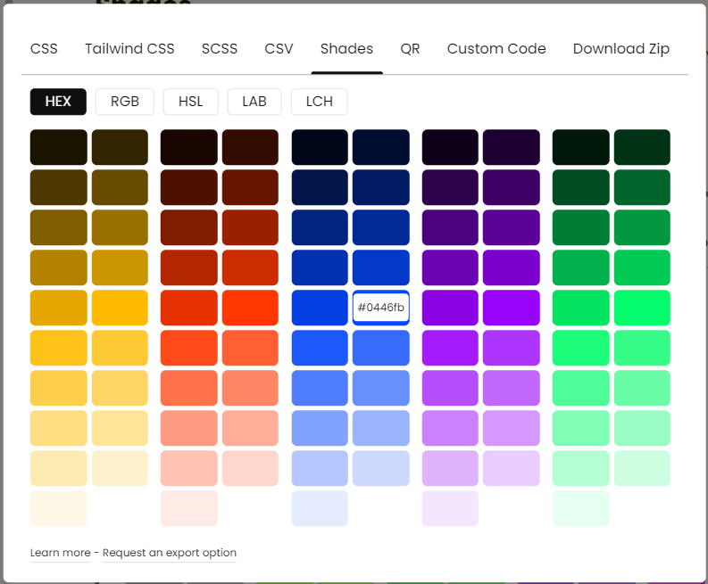
Shades
On the 5th tab, you can see different shades of the selected colors, ready to copy. They are available in the three formats of HEX, RGB, HSL, OKLAB, or OKLCH.
Shades are available for all 5 colors from left to right in the same order.
QR Code
On the 6th tab, you can see an auto-updated QR code that leads to the website with your selected colors. You can scan this code using a phone or a tablet, and view the colors on that device quickly.
Custom Code
On the 7th tab, you can see a text area to input your own custom codes and get the corresponding color values in real time. This can be helpful if you need a certain export option but can't find it in the other tabs.
To fetch the value of a certain color, we use variables in the format:
${colorName.format.shade}. So for example, ${primary.rgb.50} will give us the RGB value for the 50th shade of the primary color.
The shades you can fetch are 5, 10, 20, 30, ... , 80, 90, 95. The larger the number, the lighter the shade. Think of it as the lightness value of the color.
For reference, here are all the color names and formats you can use in the variables.
text,bg,primary,secondary,accent: return the current color values on the screen, regardless of theme (dark or light).textL,bgL,primaryL,secondaryL,accentL: return the light theme values for the current colors. If you're already on light theme, it returns the same colors, and if you're on dark mode, it returns the light theme version of the same colors.textD,bgD,primaryD,secondaryD,accentD: return the dark theme values for the current colors. If you're already on dark theme, it returns the same colors, and if you're on light mode, it returns the dark theme version of the same colors.hex,rgb,hsl,oklab,oklch: return the color values in code-ready formats, e.g.hsl(100, 80%, 50%).rgbRaw,hslRaw,oklabRaw,oklchRaw: return the color values in formats that only include the main values, e.g.100 80% 50%.rgbR,rgbG,rgbB,hslH,hslS,hslL,oklchL,oklchC,oklchH,oklabL,oklabA, andoklabB: return a certain property of the color value, for examplehslLwill return a value like50%.hexMtrl: return the Material Color value for the selected HEX, e.g.,0xFF1b1316.primaryFg,secondaryFg,accentFg: return the foreground color (on the current theme) for primary, secondary, and accent.primaryFgL,secondaryFgL,accentFgL,primaryFgD,secondaryFgD,accentFgD: return the theme-specific (D for Dark, L for Light) foreground color for primary, secondary, and accent. Since the background colors might change, foregrounds will get updated in each theme too.theme: return the current theme name, light or dark.
Combining these new formats, you can use variables like ${primaryD.hslRaw.10}, ${bgL.oklab.80}, or ${accent.oklchRaw}. Once the custom variable is set in the custom code input, it will get updated automatically every time you change the colors.
Custom Presets
There are also some presets available for your favorite UI libraries, like DaisyUI, NextUI, Material UI, Chakra UI, and so on. Just click on these presets to fill the input with the right variables and copy/paste them in a flash.
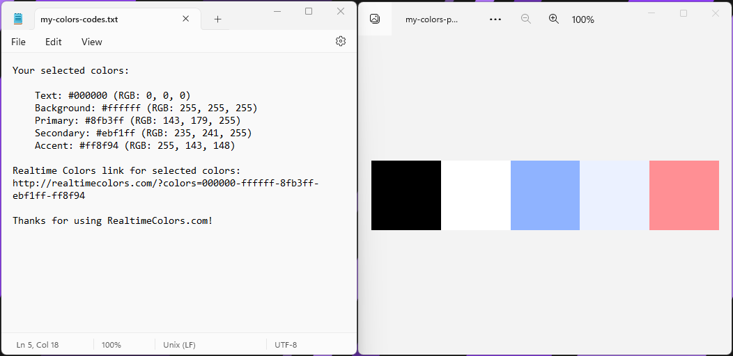
Download Zip
This option is available on the last tab. Before downloading, you can enter a name for the .zip to be saved with it. This can help keep your files organized.
Inside the Zip, you'll see two files: a .png with the palette, and a .txt file with the color codes and a link to the exact page on the site with those colors.
Fonts
To export fonts, find the Export button in the toolbar when the Fonts tab is open.
You can export the fonts along with their sizes in REM for CSS and Tailwind CSS.
If you'd like to see other export options, just contact me.
Updated on October 4, 2023