
Contrast
Contrast Checker
Using Realtime Colors, you can check the contrast between the text (foreground) and background colors to make sure the texts are readable.
There are two ways this site checks contrast:
- Automatic text color switching: This is activated whenever you're choosing colors for buttons or accent. If the existing text color starts to be unreadable, the tool automatically switches to the background color so it can maintain readability while you choose.
- Contrast ratio calculator: This feature is visible on the bottom left side of the color input in 3 symbols/lights. They indicate whether the selected color (for that input) passes the contrast checker or not.
How does the contrast ratio calculator work?
You can find the contrast ratio light on the bottom left side of each color input.
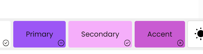
Each of these symbols mean something for the accessibility of your selected colors.
- Red / x : The contrast ratio is below 4.5, which means it doesn't fully pass AA or AAA levels.
- Yellow / - : The contrast ratio is between 4.5 and 7, which means it might pass AA but doesn't fully pass AAA. This might make only large texts readable and normal texts hardly readable.
- Green / ✓ : The contrast ratio is above 7, which means it passes both AA and AAA levels. Both large texts and normal texts are readable on this color.
For the accent color, we measure the contrast against the site background and the secondary color, since it's a graphical component, not a textual one. Also, for the accent, there is only a red light (Fail) and a green light (Pass).
Read more about color accessibility to learn what AA and AAA mean.
Updated on September 12, 2023