
Contrast
Color Schemes
Color schemes refer to the harmonical combination of different colors together. This concept is mostly used in design, art, architecture, etc. These colors could represent something, provoke a feeling, or convey a meaning.
In web and UI (User Interface) design, color schemes are often used to create meaningful and matching color palettes. The purpose is to have colors used together that "just feel right."
UI design is linked directly with branding colors. Therefore, it's important to know that color schemes are also useful for creating a brand style guide.
Take a look at some famous brands with their branding color schemes.

In this article, we'll explore color schemes for brand websites furthermore.
How are color schemes created?
Color schemes are generated based on a color wheel. On this wheel, we can see a gradient with the three primary colors (red, yellow, and blue), three secondary colors (orange, green, and purple), and various tertiary colors. There are different color wheels based on different color models, as well. Here, we'll use the HSB (standing for Hue, Saturation, Brightness) color wheel.

We'll be using this wheel to showcase different color schemes.
Types of Color Schemes
Beside custom schemes, there are 10 different color schemes that make a palette of harmonical colors, including monochromatic, complementary, analogous, triadic, square, rectangle, split complementary, double-split complementary, compound, and achromatic. Here's a brief explanation of each.
- Monochromatic: Uses different shades and tints of the same color for a harmonious look.
- Complementary: Combines colors that are opposite each other on the color wheel for a high-contrast look.
- Analogous: Uses colors next to each other on the color wheel for a cohesive look.
- Triadic: Uses three colors that are evenly spaced on the color wheel for a vibrant and balanced look.
- Square: Uses four colors that are evenly spaced on the color wheel for a bold and balanced look.
- Rectangle: Uses four colors that form a rectangle on the color wheel for a balanced and dynamic look.
- Split Complementary: Combines a color with the two colors next to its complementary color for a balanced and harmonious look.
- Double-split complementary: Combines two pairs of colors that are evenly spaced on the color wheel for a colorful and balanced look.
- Compound: Uses two or more colors that are not adjacent on the color wheel for a bold and interesting look.
- Achromatic: Uses black, white, and gray for a simple and sophisticated look.

How to use these color schemes for web design
You can either use only one scheme or a combination of colors from various schemes to create your color palette. You should also consider your brand identity or product, and choose colors that match the feeling you want it to give off.
You can also consider using shades of colors. For example, if you have only 2 colors specified for your brand, the rest can be shades of the same colors. Take a look at the example below, which is a palette made with the complementary color scheme.
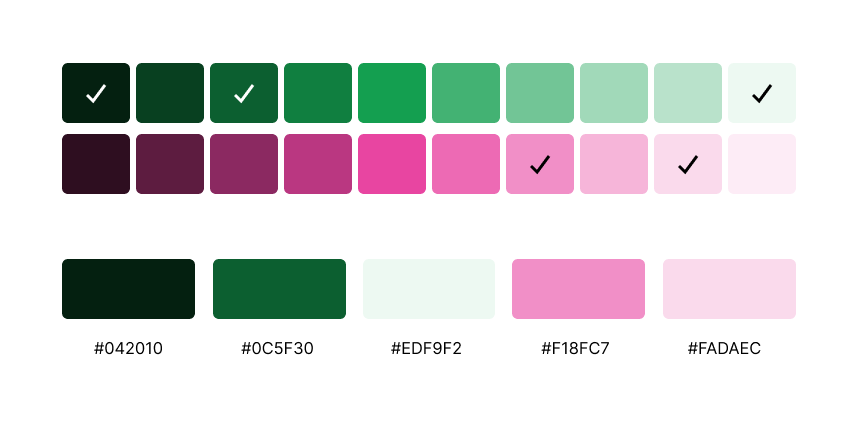
Check the colors from this palette on Realtime Colors.
What to consider when choosing a color scheme for web design
Here are a couple of things to keep in mind when creating your color palette.
- Visuals: It would create a great visual effect if your photos, artworks, etc., match your color scheme, and vice versa.
- Brand identity: Your brand identity defines and distinguishes your brand. It represents the feeling you want to convey to users.
- Products or services: You want your website to properly capture the colors of your product. Two great examples of websites reflecting product colors include Akuto Studio and JOJO Whiskey .
Updated on September 24, 2023